Radio
Overview
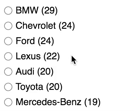 The Radio facet type generates a single-select list of choices.
Available options
| Name | Description |
|---|---|
| Data source | Where the values live (taxonomy, custom field, post attribute) |
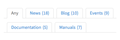
| Default label | Set a label to include an “Any” choice above the other radio buttons. The label is optional: leave it blank to entirely remove the “Any” option. It is also possible to hide the “Any” option if it is the only option left, or if there are no other selections. Note: this label is translatable with the facetwp_i18n hook. |
| Parent term | This setting is only visible if the facet’s selected Data Source is a taxonomy. If this is a hierarchical taxonomy and you want to display only child terms of a specific parent term, enter the parent’s term ID (the number only). Enter only one term ID.
Note: in a multilingual setup, setting a parent term will not work, because the parent term IDs will be different for each language. To fix this, you need to use separate facets for each language, or index the parent terms for all languages. |
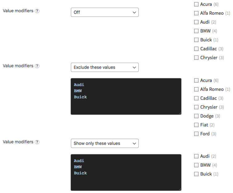
| Value modifiers | Enter a list of facet values (one per line, without commas) to include or exclude. The values need to match the label (not the slug) of the facet choice exactly, including spaces and capitalization.
For an example, see the explanation below. If your value modifiers don’t work, see this page for more info. |
| Show ghosts | Show choices that would return zero results? See the explanation below. |
| Preserve ghost order | Keep ghost choices in the same order (mixed with valid choices)? By default, ghost choices will appear at the bottom.
This setting is not available when the “Sort by” setting is set to “Highest count”, in which case the ghost order is ignored. |
| Sort by | Sort facet choices by:
To customize the sort order, for example switch the ASC/DESC order, or to sort numerically, you can use the facetwp_facet_orderby hook. |
| Limit choices |
Limit the number of facet choices? Default: enabled. The limit can be set in the “Limit” setting.
If this setting is disabled, FacetWP will load all choices but will use a safety limit of Note: this setting is available in FacetWP v4.5.1+. |
| Limit | The maximum number of choices to display. Default: 50.
If you leave this field empty, the default of This setting is only available if the “Limit choices” setting is enabled. Note: in FacetWP versions older than v4.5.1, this setting was called “Count”. |
What are value modifiers?
Value modifiers let you include or exclude certain choices from displaying. This setting requires a re-index to take effect.
Below are some examples:
What are ghosts?
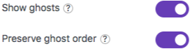 Ghosts are facet choices that do appear in the unfiltered results, but disappear after being filtered out. If a facet choice has no associated posts, then it will never appear.
When “Show ghosts” is enabled, after filtering, facet choices that would return zero results are still shown, but dimmed and not clickable.
By default, the ghosts will appear at the bottom of the list of choices. If you enable “Keep ghost order”, the ghost choices will be shown in the original order (mixed with the other, valid choices), determined by the “Sort by” setting.
Hide or customize the counts
Hide counts
To hide the counts, add the following CSS to your theme’s style.css. Be aware that this also hides the counts for all facets of type Checkboxes, Hierarchy, Range List (with UI type set to “Checkboxes” or “Radio”), Time Since (with UI type set to “Radio”), and Exclude (with UI type set to “Checkboxes” or “Radio”).
How to use custom CSS?
CSS code can be placed in your (child) theme's style.css file. Alternatively, you can add it manually between
<style>tags in the<head>section, in your (child) theme's header.php file. You can also load it with a hook in your (child) theme's functions.php file, or in the Custom Hooks add-on. To load the code only on pages with facets, use thefacetwp_scriptshook. To load it on all pages, usewp_headorwp_footer. Or you can use a code snippets plugin. More info.facetwp-counter { display: none; }
If you need to be specific about which (type of) facet to hide the counts for, use any of the following styles:
How to use custom CSS?
CSS code can be placed in your (child) theme's style.css file. Alternatively, you can add it manually between
<style>tags in the<head>section, in your (child) theme's header.php file. You can also load it with a hook in your (child) theme's functions.php file, or in the Custom Hooks add-on. To load the code only on pages with facets, use thefacetwp_scriptshook. To load it on all pages, usewp_headorwp_footer. Or you can use a code snippets plugin. More info/* Hide counts in all facets with a radio UI (Radio facets, and Range List, Exclude, and Time Since facets with UI type "Radio") */ .facetwp-radio .facetwp-counter { display: none; } /* Hide counts in all Radio facets */ [data-type="radio"] .facetwp-counter { display: none; } /* Hide counts in a specific Radio facet */ .facetwp-facet-yourfacetname .facetwp-counter { display: none; }
Remove counts
Instead of hiding the counts, it’s also possible to remove them entirely from the facet’s HTML. Add the following code to your (child) theme’s functions.php to do this for a specific facet:
How to use custom PHP code?
PHP code can be added to your (child) theme's functions.php file. Alternatively, you can use the Custom Hooks add-on, or a code snippets plugin. More info
add_filter( 'facetwp_facet_html', function( $output, $params ) { if ( 'my_facet_name' == $params['facet']['name'] ) { // Replace 'my_facet_name' with the name of your facet $output = preg_replace( '/<span class="facetwp-counter">[^<]*<\/span>/', '', $output ); } return $output; }, 10, 2 );
Or you can select by facet type. Note that this will only work for the following facet types: Radio, Checkboxes, Hierarchy, Range List (with UI type set to “Checkboxes” or “Radio”), Time Since (with UI type set to “Radio”), and Exclude (with UI type set to “Checkboxes” or “Radio”).
How to use custom PHP code?
PHP code can be added to your (child) theme's functions.php file. Alternatively, you can use the Custom Hooks add-on, or a code snippets plugin. More info
add_filter( 'facetwp_facet_html', function( $output, $params ) { if ( 'radio' == $params['facet']['type'] ) { // Works for: 'checkboxes', 'radio', 'hierarchy', 'range_list', 'time_since' $output = preg_replace( '/<span class="facetwp-counter">[^<]*<\/span>/', '', $output ); } return $output; }, 10, 2 );
Customize counts
To remove the ( ) parentheses surrounding the count number, add the following to your (child) theme’s functions.php.
This snippet works only for the Radio facet type. If you replace the radio facet type in line 2, you can do the same for the following facet types: Checkboxes, Hierarchy, Range List (with UI type set to “Checkboxes” or “Radio”), Time Since (with UI type set to “Radio”), and Exclude (with UI type set to “Checkboxes” or “Radio”).
How to use custom PHP code?
PHP code can be added to your (child) theme's functions.php file. Alternatively, you can use the Custom Hooks add-on, or a code snippets plugin. More info
add_filter( 'facetwp_facet_html', function( $output, $params ) { if ( 'radio' == $params['facet']['type'] ) { $output = preg_replace('/(<span class="facetwp-counter">)\((\d+)\)(<\/span>)/', '$1$2$3', $output); } return $output; }, 10, 2 );
To replace the ( ) parentheses with [ ] square brackets, use the following code instead. Adapt as needed in the $1[$2]$3 replacement part in line 3.
How to use custom PHP code?
PHP code can be added to your (child) theme's functions.php file. Alternatively, you can use the Custom Hooks add-on, or a code snippets plugin. More info
add_filter( 'facetwp_facet_html', function( $output, $params ) { if ( 'radio' == $params['facet']['type'] ) { $output = preg_replace('/(<span class="facetwp-counter">)\((\d+)\)(<\/span>)/', '$1[$2]$3', $output); } return $output; }, 10, 2 );
Hide the “Any” option
Hide the “Any” option entirely
To entirely remove the “Any” option, make sure the “Default label” setting is empty.
Hide the “Any” option if it is the only option left
If you have the “Show ghosts” setting disabled, after filtering you can have only one remaining “Any” option, when there are no other options left. To prevent this, you can use this example code to (in general) hide any facet that has no options left. This code will also hide Radio facets with only the “Any” option left.
Hide the “Any” option when there are no selections
To hide the “Any” option when the facet has no other selections, add the following snippet to your (child) theme’s functions.php. Make sure to replace my-facet-name in line 6 with the name of your Radio facet.
How to use custom PHP code?
PHP code can be added to your (child) theme's functions.php file. Alternatively, you can use the Custom Hooks add-on, or a code snippets plugin. More info
add_action( 'facetwp_scripts', function() { ?> <script> document.addEventListener('facetwp-loaded', function() { var facet_name = 'my-facet-name'; // Replace 'my-facet-name' with the name of your facet var any = fUtil('.facetwp-facet-' + facet_name + ' > [data-value=""]'); // The 'Any' choice has no value // Hide the Any choice if the facet has no selections if ( 'object' == typeof FWP.facets[facet_name] && ! FWP.facets[facet_name].length ) { any.addClass('facetwp-hidden'); } }); </script> <?php }, 100 );
Styling Radio facets
Radio facets are easy to style. Just like in for example Checkboxes facets, the icons are not real HTML (<input type="radio">) form elements, but a simple CSS background image applied to a <div>. This background image can be replaced (or removed) with a few lines of CSS.
Below are some examples of how to style Radio facet choices as buttons/pills, or as tabs.
Style Radio facet choices as buttons
If you add the following code to your (child) theme’s functions.php (or the CSS to your style.css file), all Radio facet choices will be styled as buttons/pills, making them look like this:
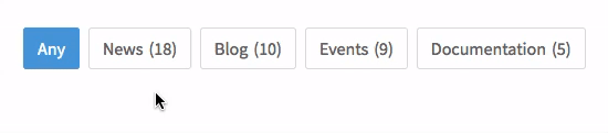
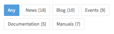
The CSS also applies a background-color and border-color on hover and when the choice is selected. It also accounts for the buttons wrapping to multiple rows on smaller screen widths.
How to use custom PHP code?
PHP code can be added to your (child) theme's functions.php file. Alternatively, you can use the Custom Hooks add-on, or a code snippets plugin. More info
add_action( 'facetwp_scripts', function() { ?> <style> .facetwp-radio { background: none; display: inline-block; line-height: 1em; padding: 10px 12px; /* top/bottom right/left */ margin: 0 8px 8px 0; /* top right bottom left */ border: 1px solid #ddd; border-radius: 3px; } /* Style the hover and 'checked' states */ .facetwp-radio:hover, .facetwp-radio.checked { background-image: none; background-color: #4f9fdd; border-color: #4f9fdd; color: #ffffff; } </style> <?php }, 100 );
Style Radio facet choices as tabs
If you add the following code to your (child) theme’s functions.php (or the CSS to your style.css file), all Radio facet choices will be styled as tabs, making them look like this:
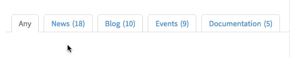
The CSS also applies a background-color on hover, and a different color when the choice is selected. It also accounts for the tabs wrapping to multiple rows on smaller screen widths.
Lines 6-9 will make the facet container itself fill the whole width of its parent container element, which allows the bottom gray line to fill that whole width. You can remove those lines if you don’t want that to happen.
How to use custom PHP code?
PHP code can be added to your (child) theme's functions.php file. Alternatively, you can use the Custom Hooks add-on, or a code snippets plugin. More info
add_action( 'facetwp_scripts', function() { ?> <style> /* Optionally make the facet take the full width of its container, so it can have a bottom line over the whole width */ .facetwp-type-radio { width: 100%; border-bottom: 1px solid #ddd; /* gray */ } .facetwp-radio { background: none; display: inline-block; line-height: 1em; padding: 9px 14px; /* top/bottom right/left */ margin: 15px 0 -1px 10px; /* top right bottom left. The'left' value is the distance between tabs */ border: 1px solid #ddd; /* gray */ border-radius: 5px 5px 0 0; color: #4f9fdd; /* blue */ position: relative; z-index: 1; } /* border-bottom line solution that supports wrapping tabs to multiple lines */ .facetwp-radio:before, .facetwp-radio:after { content: ''; display: inline-block; border-bottom: 1px solid #ddd; /* gray */ position: absolute; z-index: 0; height: 1px; width: 12px; /* distance between tabs as set on L16 with margin-left + 2px */ left: -12px; /* distance between tabs as set on L16 with margin-left + 2px */ bottom: -1px; } .facetwp-radio:after{ left: auto; right: -12px; /* (minus) distance between tabs as set on L16 with margin-left + 2px */ } /* Style the tab 'checked' state */ .facetwp-radio.checked { background-image: none; background-color: #fff; /* white */ border-bottom-color: #fff; /* white */ color: #888; /* dark gray */ } /* Style the tab hover state */ .facetwp-radio:not(.checked):not(.disabled):hover { background-image: none; background-color: #4f9fdd; /* blue */ border-color: #4f9fdd; /* blue */ border-bottom-color: #ddd; /* gray */ color: #fff; /* white */ } </style> <?php }, 100 );
Style Radio facet choices as checkboxes
To change a specific Radio facet’s radio icons to checkbox icons, add the following code to your (child) theme’s functions.php (or the CSS to your style.css file).
Make sure to change my-facet-name in line 5 and line 10 to the name (not the label) of your Radio facet.
Note that this will not change the behavior of the Radio facet: it will still be single-select, as opposed to a real Checkboxes facet, which is multi-select. Also keep in mind that a Radio facet cannot display a hierarchy of choices, like the Checkboxes facet can (with its Hierarchical setting enabled).
How to use custom PHP code?
PHP code can be added to your (child) theme's functions.php file. Alternatively, you can use the Custom Hooks add-on, or a code snippets plugin. More info
add_action( 'facetwp_scripts', function() { ?> <style> .facetwp-facet-my-facet-name .facetwp-radio { background: url('/wp-content/plugins/facetwp/assets/images/checkbox.png') 0 50% no-repeat; background-size: 14px 14px; } .facetwp-facet-my-facet-name .facetwp-radio.checked { background-image: url('/wp-content/plugins/facetwp/assets/images/checkbox-on.png'); } </style> <?php }, 100 );