Checkboxes
Overview
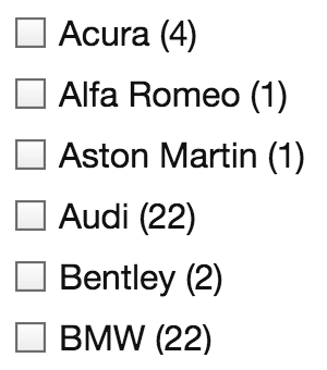 The Checkboxes facet type lets users select multiple values.
Available options
| Name | Description |
|---|---|
| Data source | Where the values live (taxonomy, custom field, post attribute). When choosing a hierarchical taxonomy, read this warning. |
| Parent term | This setting is only visible if the facet’s selected Data Source is a taxonomy. If this is a hierarchical taxonomy and you want to display only child terms of a specific parent term, enter the parent’s term ID (the number only). Enter only one term ID.
Note: in a multilingual setup, setting a parent term will not work, because the parent term IDs will be different for each language. To fix this, you need to use separate facets for each language, or index the parent terms for all languages. |
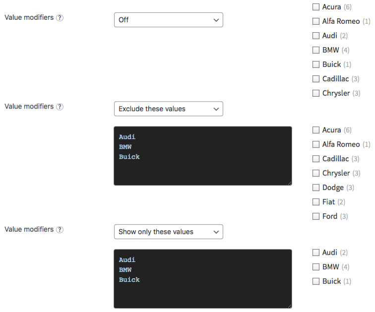
| Value modifiers | Enter a list of facet values (one per line, without commas) to include or exclude. The values need to match the label (not the slug) of the facet choice exactly, including spaces and capitalization.
In hierarchical facets, if you use “Show only these values”, if you want only specific child terms to show up, you need to include their parent terms (on all levels) too. Or you need to set their parent term ID in the “Parent term” setting. If you use “Exclude these values”, you can directly exclude child terms, without excluding their parent terms. For an example, see the explanation below. If your value modifiers don’t work, see this page for more info. |
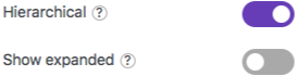
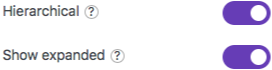
| Hierarchical | Whether to display the facet choices visually as a hierarchy, by ordering the child terms below their parent term, indenting the child terms, and by showing [+] / [-] icons to toggle the child levels. This setting only appears if Data Source is set to a taxonomy, and it will only have an effect if the chosen taxonomy is actually a hierarchical taxonomy. Notes:
|
| Show expanded | This option only appears if the Hierarchical setting is enabled. By default, all child levels will be in the collapsed state and can be expanded with the [+] icons. With this setting enabled, child levels will be expanded all the time. If you want to hide the expand/collapse icons in this case, see the solution below. |
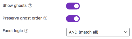
| Show ghosts | Show choices that would return zero results? See the explanation below. |
| Preserve ghost order | This option only appears if the Show ghosts setting is enabled. By default, ghost choices will appear at the bottom. With this setting enabled, ghost choices are kept in the same order (mixed with valid choices).
This setting is not available when the “Sort by” setting is set to “Highest count”, in which case the ghost order is ignored. |
| Facet logic | The logic used between multiple choices within the facet. Selecting “AND (match all)” will reduce the results with multiple choices, while “OR (match any)” will increase the results.
For example, assume a facet with the choices “Apple”, “Banana”, and “Pear”:
Notes:
|
| Sort by | Sort facet choices by:
To customize the sort order, for example switch the ASC/DESC order, or to sort numerically, you can use the facetwp_facet_orderby hook. |
| Limit choices |
Limit the number of facet choices? Default: enabled. The limit can be set in the “Limit” setting.
If this setting is disabled, FacetWP will load all choices but will use a safety limit of Note: this setting is available in FacetWP v4.5.1+. |
| Limit | The maximum number of choices to display. Default: 50. Be aware that if your Data source is a hierarchical taxonomy, the limit includes the child terms/categories. If the limit is set too low, some (child) choices, or the [+] icon(s) will not show up.
If you leave this field empty, the default of This setting is only available if the “Limit choices” setting is enabled. Note: in FacetWP versions older than v4.5.1, this setting was called “Count”. |
| Enable soft limit |
Display a “See {num} more” / “See less” toggle link after this many choices? Default: disabled. The soft limit can be set in the “Soft limit” setting.
This setting is only available if the “Hierarchical” setting is disabled. Note: this setting is available in FacetWP v4.5.1+. |
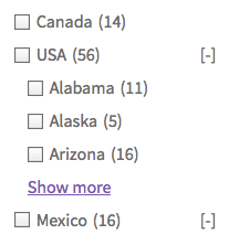
| Soft limit | The number of choices before showing a “See {num} more” / “See less” link. Set to -1, leave empty, or disable the “Enable soft limit” setting to display all options.
When a facet choice is selected within the initially hidden part, the hidden part will automatically be toggled open on refresh. If you want this to happen when any facet choice is selected, see the example below. Note: the text is translatable with the facetwp_i18n hook. It is also a This setting is only available if the “Enable soft limit” setting is enabled and the “Hierarchical” setting is disabled. |
What are value modifiers?
Value modifiers let you include or exclude certain choices from displaying. This setting requires a re-index to take effect.
Below are some examples:
In hierarchical facets, if you use “Show only these values”, if you want only specific child terms to show up, you need to include their parent terms (on all levels) too. Or you need to set their parent term ID in the “Parent term” setting. If you use “Exclude these values”, you can directly exclude child terms, without excluding their parent terms.
What are ghosts?
 Ghosts are facet choices that do appear in the unfiltered results, but disappear after being filtered out. If a facet choice has no associated posts, then it will never appear.
When “Show ghosts” is enabled, after filtering, facet choices that would return zero results are still shown, but dimmed and not clickable.
By default, the ghosts will appear at the bottom of the list of choices. If you enable “Preserve ghost order“, the ghost choices will be shown in the original order (mixed with the other, valid choices), determined by the “Sort by” setting.
Note that with the “Facet logic” set to “OR (match any)”, there will never be ghosts caused by selections made within the facet itself. If the Facet logic setting is set to “AND (match all)”, the facet will show ghosts caused by selections made within the facet itself. In both situations, the facet will show ghosts caused by selections made in other facets.
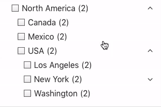
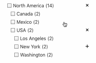
Hierarchical checkbox behavior
 With the “Hierarchical” setting enabled, the facet’s checkbox behavior is as follows:
- If a parent item is selected, all children on all sublevels of that parent are automatically deselected.
- If a child item is selected, each parent item on each level above that child item is automatically deselected.
- If a child item is deselected, each level above it without a selection will collapse.
In other words: parent and child items cannot be selected at the same time and levels will collapse if nothing is selected.
If you want to keep all levels expanded all the time, enable the Show expanded setting. And if you want to automatically expand child items when clicking a parent item, check the code examples below.
Indexing of term hierarchies
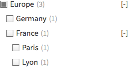
Paris term selected in the back-end will be displayed in the front-end results if you select “Europe” or “France” in the facet.With the “Hierarchical” setting enabled, FacetWP automatically indexes both explicit and implicit term hierarchies.
If your taxonomy includes Europe > France and a post has only the France term selected, then Europe will get indexed too for that post.
On the front-end this means that if you have a post that has only the Paris term selected, but not its parent terms (France or Europe), the post will still be displayed in the results if you filter by “Europe”, or “France” in the facet.
Automatically expand checked hierarchical checkboxes
 With the “Hierarchical” setting enabled and the “Show expanded” setting disabled, clicking a parent item will not expand the child items; only clicking the expand
 [+] icon will do that.
If you want to automatically expand the direct child items when their parent item is clicked, you can use this code:
How to use custom PHP code?
PHP code can be added to your (child) theme's functions.php file. Alternatively, you can use the Custom Hooks add-on, or a code snippets plugin. More info
<?php add_action( 'wp_footer', function() { ?> <script> document.addEventListener('facetwp-loaded', function() { fUtil('.facetwp-checkbox.checked .facetwp-expand').trigger('click'); }); </script> <?php }, 100 );
If you want to automatically expand all child items on each sublevel when their parent item is clicked, you can use this code:
How to use custom PHP code?
PHP code can be added to your (child) theme's functions.php file. Alternatively, you can use the Custom Hooks add-on, or a code snippets plugin. More info
<?php add_action( 'wp_footer', function() { ?> <script> document.addEventListener('facetwp-loaded', function() { fUtil('.facetwp-checkbox.checked .facetwp-expand, .facetwp-checkbox.checked + .facetwp-depth .facetwp-expand').trigger('click'); }); </script> <?php }, 100 );
Hide the expand- and collapse buttons
 With the “Hierarchical” setting enabled and the “Show expanded” setting enabled, all child items of all parents items will be visible by default.
The expand/collapse icons will still keep working: you can collapse each level. However, after each facet interaction (also with other facets), the whole hierarchy will expand again. This makes the expand/collapse icons not very useful in this situation. To hide them, add this CSS into your (child) theme’s style.css:
How to use custom CSS?
CSS code can be placed in your (child) theme's style.css file. Alternatively, you can add it manually between
<style>tags in the<head>section, in your (child) theme's header.php file. You can also load it with a hook in your (child) theme's functions.php file, or in the Custom Hooks add-on. To load the code only on pages with facets, use thefacetwp_scriptshook. To load it on all pages, usewp_headorwp_footer. Or you can use a code snippets plugin. More info.facetwp-checkbox .facetwp-expand { display: none; }
Customize the expand- and collapse buttons
The following code examples show how to replace the expand [+] and collapse [-] toggle icons in hierarchical Checkboxes facets. You can let them use text, HTML, or images like PNGs or SVGs.
Using HTML or Unicode icons
The following example replaces both icons with a Unicode chevron icon (⌃, ⌃), wrapped in a <span> tag, with opened and closed classes.
The second hook adds a few lines of CSS to vertically align the icon, and rotates it 180 degrees when the class is closed:
How to use custom PHP code?
PHP code can be added to your (child) theme's functions.php file. Alternatively, you can use the Custom Hooks add-on, or a code snippets plugin. More info
add_filter( 'facetwp_assets', function( $assets ) { FWP()->display->json['expand'] = '<span class="closed">⌃</span>'; FWP()->display->json['collapse'] = '<span class="opened">⌃</span>'; return $assets; }); add_action( 'wp_head', function() { ?> <style> .facetwp-type-checkboxes .facetwp-expand span { display: inline-block; position: relative; top: 0.2em; } .facetwp-type-checkboxes .facetwp-expand span.closed { transform: rotate(180deg); top: -0.1em; } </style> <?php } );
Using SVG icons
It is also possible to replace the toggle icons with any SVG icon.
In this example we are using the plus and minus SVG icons from the free FontAwesome icon library.
The second hook adds a few lines of CSS to vertically align and resize the icons, and to add a rectangular border in the same color as the checkboxes:
How to use custom PHP code?
PHP code can be added to your (child) theme's functions.php file. Alternatively, you can use the Custom Hooks add-on, or a code snippets plugin. More info
add_filter( 'facetwp_assets', function( $assets ) { FWP()->display->json['expand'] = '<svg xmlns="http://www.w3.org/2000/svg" viewBox="0 0 448 512"><!--!Font Awesome Free 6.5.1 by @fontawesome - https://fontawesome.com License - https://fontawesome.com/license/free Copyright 2024 Fonticons, Inc.--><path d="M256 80c0-17.7-14.3-32-32-32s-32 14.3-32 32V224H48c-17.7 0-32 14.3-32 32s14.3 32 32 32H192V432c0 17.7 14.3 32 32 32s32-14.3 32-32V288H400c17.7 0 32-14.3 32-32s-14.3-32-32-32H256V80z"/></svg>'; FWP()->display->json['collapse'] = '<svg xmlns="http://www.w3.org/2000/svg" viewBox="0 0 448 512"><!--!Font Awesome Free 6.5.1 by @fontawesome - https://fontawesome.com License - https://fontawesome.com/license/free Copyright 2024 Fonticons, Inc.--><path d="M432 256c0 17.7-14.3 32-32 32L48 288c-17.7 0-32-14.3-32-32s14.3-32 32-32l352 0c17.7 0 32 14.3 32 32z"/></svg>'; return $assets; }); add_action( 'wp_head', function() { ?> <style> .facetwp-type-checkboxes .facetwp-expand svg { width:14px; height: 14px; padding: 1px; display: inline-block; box-sizing: border-box; border: 1px solid #6f6f6f; position: relative; top: 1px; color: #555555; /* the color of the SVGs */ fill: currentColor; /* lets the SVG itself use the color as set with the 'color' property above */ } </style> <?php } );
You can also use only a “+” icon and animate a 45-degree rotation of it to an “x” when the parent is opened. For this to work, the opened class needs to be on the facetwp-expand element. See the accordion toggle example below.
Toggle hierarchical checkbox levels in accordion style
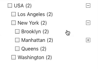
If your Checkboxes facet has the Hierarchical setting enabled, and the source is a hierarchical taxonomy, any child terms will be ordered below their parent term, and will be indented. Also open- ([+]) and close ([-]) icons will be displayed, to toggle the child levels.
These toggles work independently from each other: you can have multiple parent terms opened at the same time and have to close them one by one.
If you prefer the toggles to work accordion-style, you can add the following code to your (child) theme’s functions.php. With this code in place, when clicking a [+] icon, all other toggles at the same level will close, so only one parent will be opened at the same time:
How to use custom PHP code?
PHP code can be added to your (child) theme's functions.php file. Alternatively, you can use the Custom Hooks add-on, or a code snippets plugin. More info
add_action( 'wp_head', function() { ?> <script> (function($) { // Accordion part 1: toggle the 'opened' class on click of icons and close other parents on the same level. $(document).on('click', '.facetwp-type-checkboxes .facetwp-expand', function(e) { $(this).toggleClass('opened'); $(this).closest('.facetwp-checkbox').siblings('.facetwp-checkbox').each(function() { $(this).next('.facetwp-depth').removeClass('visible'); $(this).children('.facetwp-expand').removeClass('opened'); }); e.stopPropagation(); }); // Accordion part 2: if on first pageload a child is already selected, give the parent an 'opened' class. $(document).on('facetwp-loaded', function() { FWP.hooks.addAction('facetwp/loaded', function() { $('.facetwp-type-checkboxes .facetwp-depth').each(function() { if ($(this).hasClass('visible')) { $(this).prev('.facetwp-checkbox').children('.facetwp-expand').addClass('opened'); } }); }); }); })(jQuery); </script> <?php } );
The above code also adds the opened class to the toggle icon element when its level is opened. This class can be used to style the open and close icons differently.
The following example displays the open and close icons as a FontAwesome plus icon, set as CSS background. The icon is then rotated 45 degrees to an “x” when the parent level is opened, much like in the navigation on the left side of this page.
For this to work, the two default icons need to be removed first:
How to use custom PHP code?
PHP code can be added to your (child) theme's functions.php file. Alternatively, you can use the Custom Hooks add-on, or a code snippets plugin. More info
// Remove the default icons add_filter( 'facetwp_assets', function( $assets ) { FWP()->display->json['expand'] = ''; FWP()->display->json['collapse'] = ''; return $assets; }); // Style the open/close icons with a rotating FontAwesome "+" icon: // SVG + icon used: https://fontawesome.com/icons/plus?f=classic&s=solid // SVG icons need to be encoded as data URI to use them as CSS background-images. For example with this tool: https://codepen.io/yoksel/pen/MWKeKK add_action( 'wp_head', function() { ?> <style> .facetwp-type-checkboxes .facetwp-expand:before { content: ""; width:14px; height: 14px; display: inline-block; background: transparent url("data:image/svg+xml,%3Csvg xmlns='http://www.w3.org/2000/svg' viewBox='0 0 448 512'%3E%3C!--!Font Awesome Free 6.5.1 by @fontawesome - https://fontawesome.com License - https://fontawesome.com/license/free Copyright 2024 Fonticons, Inc.--%3E%3Cpath d='M256 80c0-17.7-14.3-32-32-32s-32 14.3-32 32V224H48c-17.7 0-32 14.3-32 32s14.3 32 32 32H192V432c0 17.7 14.3 32 32 32s32-14.3 32-32V288H400c17.7 0 32-14.3 32-32s-14.3-32-32-32H256V80z'/%3E%3C/svg%3E") left top no-repeat; background-size: 14px 14px; -o-transition: transform 0.1s ease-in; -webkit-transition: -webkit-transform 0.1s ease-in; transition: -webkit-transform 0.1s ease-in; transition: transform 0.1s ease-in; } .facetwp-type-checkboxes .facetwp-expand.opened:before { -ms-transform: rotate(-45deg); -webkit-transform: rotate(-45deg); transform: rotate(-45deg); -ms-transform-origin: center center; -webkit-transform-origin: center center; transform-origin: center center; } </style> <?php } );
Hide or customize the counts
Hide counts
To hide the counts, add the following CSS to your theme’s style.css. Be aware that this also hides the counts for all facets of type Radio, Hierarchy, Range List (with UI type set to “Checkboxes” or “Radio”), Time Since (with UI type set to “Radio), and Exclude (with UI type set to “Checkboxes” or “Radio”).
How to use custom CSS?
CSS code can be placed in your (child) theme's style.css file. Alternatively, you can add it manually between
<style>tags in the<head>section, in your (child) theme's header.php file. You can also load it with a hook in your (child) theme's functions.php file, or in the Custom Hooks add-on. To load the code only on pages with facets, use thefacetwp_scriptshook. To load it on all pages, usewp_headorwp_footer. Or you can use a code snippets plugin. More info.facetwp-counter { display: none; }
If you need to be specific about which (type of) facet to hide the counts for, use any of the following styles:
How to use custom CSS?
CSS code can be placed in your (child) theme's style.css file. Alternatively, you can add it manually between
<style>tags in the<head>section, in your (child) theme's header.php file. You can also load it with a hook in your (child) theme's functions.php file, or in the Custom Hooks add-on. To load the code only on pages with facets, use thefacetwp_scriptshook. To load it on all pages, usewp_headorwp_footer. Or you can use a code snippets plugin. More info/* Hide counts in all facets with a checkboxes UI (Checkboxes facets, and Range List and Exclude facets with UI type "Checkboxes" */ .facetwp-checkbox .facetwp-counter { display: none; } /* Hide counts in all Checkboxes facets */ [data-type="checkboxes"] .facetwp-counter { display: none; } /* Hide counts in a specific Checkboxes facet */ .facetwp-facet-yourfacetname .facetwp-counter { display: none; }
Remove counts
Instead of hiding the counts, it’s also possible to remove them entirely from the facet’s HTML. Add the following code to your (child) theme’s functions.php to do this for a specific facet:
How to use custom PHP code?
PHP code can be added to your (child) theme's functions.php file. Alternatively, you can use the Custom Hooks add-on, or a code snippets plugin. More info
add_filter( 'facetwp_facet_html', function( $output, $params ) { if ( 'my_facet_name' == $params['facet']['name'] ) { // Replace 'my_facet_name' with the name of your facet $output = preg_replace( '/<span class="facetwp-counter">[^<]*<\/span>/', '', $output ); } return $output; }, 10, 2 );
Or you can select by facet type. Note that this will only work for the following facet types: Checkboxes, Radio, Hierarchy, Range List (with UI type set to “Checkboxes” or “Radio”), Time Since (with UI type set to “Radio”), and Exclude (with UI type set to “Checkboxes” or “Radio”).
How to use custom PHP code?
PHP code can be added to your (child) theme's functions.php file. Alternatively, you can use the Custom Hooks add-on, or a code snippets plugin. More info
add_filter( 'facetwp_facet_html', function( $output, $params ) { if ( 'checkboxes' == $params['facet']['type'] ) { // Works for: 'checkboxes', 'radio', 'hierarchy', 'range_list', 'time_since' $output = preg_replace( '/<span class="facetwp-counter">[^<]*<\/span>/', '', $output ); } return $output; }, 10, 2 );
Customize counts
To remove the ( ) parentheses surrounding the count number, add the following to your (child) theme’s functions.php.
This snippet works only for the Checkboxes facet type. If you replace the checkboxes facet type in line 2, you can do the same for the following facet types: Radio, Hierarchy, Range List (with UI type set to “Checkboxes” or “Radio”), Time Since (with UI type set to “Radio”), and Exclude (with UI type set to “Checkboxes” or “Radio”).
How to use custom PHP code?
PHP code can be added to your (child) theme's functions.php file. Alternatively, you can use the Custom Hooks add-on, or a code snippets plugin. More info
add_filter( 'facetwp_facet_html', function( $output, $params ) { if ( 'checkboxes' == $params['facet']['type'] ) { $output = preg_replace('/(<span class="facetwp-counter">)\((\d+)\)(<\/span>)/', '$1$2$3', $output); } return $output; }, 10, 2 );
To replace the ( ) parentheses with [ ] square brackets, use the following code instead. Adapt as needed in the $1[$2]$3 replacement part in line 3.
How to use custom PHP code?
PHP code can be added to your (child) theme's functions.php file. Alternatively, you can use the Custom Hooks add-on, or a code snippets plugin. More info
add_filter( 'facetwp_facet_html', function( $output, $params ) { if ( 'checkboxes' == $params['facet']['type'] ) { $output = preg_replace('/(<span class="facetwp-counter">)\((\d+)\)(<\/span>)/', '$1[$2]$3', $output); } return $output; }, 10, 2 );
Style long, wrapping, multi-line checkbox labels
If you are using a Checkboxes facet that has long, wrapping label texts, and/or the facet is restricted in the width it can take up, the choice labels will have a large line height (depending on your theme CSS), and the checkbox background icons will be aligned to the middle of the label’s height. This mostly does not look pretty.
To improve the styling in this situation, add the following snippet to your (child) theme’s functions.php.
The CSS adds a smaller line-height to the wrapped labels and compensates that with a larger margin-bottom. It also makes sure the checkbox icons align at the top of the multi-line label, instead of in the middle of its height.
Depending on your theme’s font you may need to tweak the label’s line-height in line 6, and/or the checkbox background’s top alignment in line 8:
How to use custom PHP code?
PHP code can be added to your (child) theme's functions.php file. Alternatively, you can use the Custom Hooks add-on, or a code snippets plugin. More info
add_action( 'wp_head', function() { ?> <style> .facetwp-type-checkboxes .facetwp-checkbox { line-height: 1.3em; /* Add smaller line-height to wrapped labels */ margin-bottom: 9px; /* Compensate for the new label line-height */ background-position: 0 0.2em; /* Tweak top value for chosen line-height above */ padding-right: 20px; /* Make room for the expand icon in hierarchical Checkboxes facets */ } .facetwp-type-checkboxes .facetwp-checkbox .facetwp-expand { margin-right: -20px; /* Compensate for the padding-right in hierarchical Checkboxes facets. Must be the same value as padding-right above */ } </style> <?php }, 100 );
Style Checkboxes facet choices as toggles
Checkboxes facets are easy to style. Just like in for example Radio facets, the icons are not real HTML (<input type="checkbox">) form elements, but a simple CSS background image applied to a <div>. This background image can be replaced (or removed) with a few lines of CSS.
The following example CSS replaces all checkbox icons with toggle icons:
How to use custom CSS?
CSS code can be placed in your (child) theme's style.css file. Alternatively, you can add it manually between
<style>tags in the<head>section, in your (child) theme's header.php file. You can also load it with a hook in your (child) theme's functions.php file, or in the Custom Hooks add-on. To load the code only on pages with facets, use thefacetwp_scriptshook. To load it on all pages, usewp_headorwp_footer. Or you can use a code snippets plugin. More info/* * Free SVG icons used: * https://fontawesome.com/icons/toggle-off?f=classic&s=solid * https://fontawesome.com/icons/toggle-on?f=classic&s=solid * Convert icons to CSS background images: https://www.svgbackgrounds.com/tools/svg-to-css/ * Change icon color: use a hex color in the fill value (%23 = #) */ .facetwp-checkbox { background-image: url('data:image/svg+xml,<svg xmlns="http://www.w3.org/2000/svg" height="1em" viewBox="0 0 576 512"><!--! Font Awesome Free 6.4.0 by @fontawesome - https://fontawesome.com License - https://fontawesome.com/license (Commercial License) Copyright 2023 Fonticons, Inc. --><path d="M384 128c70.7 0 128 57.3 128 128s-57.3 128-128 128H192c-70.7 0-128-57.3-128-128s57.3-128 128-128H384zM576 256c0-106-86-192-192-192H192C86 64 0 150 0 256S86 448 192 448H384c106 0 192-86 192-192zM192 352a96 96 0 1 0 0-192 96 96 0 1 0 0 192z" fill="%23777777"/></svg>'); background-size: 28px 22px; background-position: left center; padding-left: 36px; } .facetwp-checkbox.checked { background-image: url('data:image/svg+xml,<svg xmlns="http://www.w3.org/2000/svg" height="1em" viewBox="0 0 576 512"><!--! Font Awesome Free 6.4.0 by @fontawesome - https://fontawesome.com License - https://fontawesome.com/license (Commercial License) Copyright 2023 Fonticons, Inc. --><path d="M192 64C86 64 0 150 0 256S86 448 192 448H384c106 0 192-86 192-192s-86-192-192-192H192zm192 96a96 96 0 1 1 0 192 96 96 0 1 1 0-192z" fill="%23777777" /></svg>'); } /* Optional: remove labels: .facetwp-checkbox { width: 28px; height: 22px; padding: 0; } .facetwp-checkbox .facetwp-display-value, .facetwp-checkbox .facetwp-counter{ display: none; } */
In this example, we used free FontAwesome icons, but you could use any icon you like. These can be simple PNGs, but for this example we chose SVGs. To be able to use them as CSS background images, we first converted them to data URIs (with this online tool).
The SVG icons’ color can be changed with the fill attribute in the data URI. Note that you need to use %23 instead of # in the HEX color code.
Automatically toggle “See more” on any facet selection
When you are using the Soft limit setting, and a facet choice is selected within the initially hidden part, the hidden part will automatically be toggled open on refresh (after using any facet). If you want this to happen when any facet choice is selected (also choices that are not in the initially hidden part), add the following code to your (child) theme’s functions.php:
How to use custom PHP code?
PHP code can be added to your (child) theme's functions.php file. Alternatively, you can use the Custom Hooks add-on, or a code snippets plugin. More info
add_action( 'facetwp_scripts', function() { ?> <script> (function($) { if ('undefined' !== typeof FWP.hooks) { FWP.hooks.addAction('facetwp/loaded', function() { $('.facetwp-type-checkboxes').each(function() { var $el = $(this).find('.facetwp-toggle:not(.facetwp-hidden'); var $overflow = $(this).find('.facetwp-overflow'); // Auto-expand after refresh, if any checkbox is checked (in the overflow or not) if (0 < $(this).find('.facetwp-checkbox.checked').len() && $overflow.hasClass('facetwp-hidden')) { $el.trigger('click'); } }); }, 1000); } })(fUtil); </script> <?php }, 100 );
Translate or change the “See more” / “See less” link
If you are using the “Soft limit” setting, and want to change or translate the “See {num} more” / “See less” link texts, you can use a translation plugin to change the __() strings, or you can use the facetwp_i18n hook.
Another way is using a gettext_{$domain} WordPress filter. Add the following code to your (child) theme’s functions.php:
How to use custom PHP code?
PHP code can be added to your (child) theme's functions.php file. Alternatively, you can use the Custom Hooks add-on, or a code snippets plugin. More info
add_filter( 'gettext_fwp-front', function( $translated_text, $text, $domain ) { if ( 'See {num} more' == $text ) { $translated_text = 'Show {num} more'; } elseif ( 'See less' == $text ) { $translated_text = 'Show less'; } return $translated_text; }, 10, 3 );
Add show more/less toggle links for child levels in a hierarchical Checkboxes facet
If you have a hierarchical Checkboxes facet that uses a hierarchical taxonomy with many terms on child levels, you may want to reduce the number of child terms shown initially.
The following snippet adds “show more”/“show less” toggle links after a certain number of choices on child levels, similar to how the Soft limit feature works for non-hierarchical Checkboxes facets.
In this example, we hide choices from the fourth choice on each child level (which means that the maximum number of choices shown on a child level is three). You can customize this number by changing the 4 in the CSS (n+4) on lines 6, 7 and 10, and in the JavaScript on line 35.
The “Show more” and “Show less” label texts can be customized in lines 30-31.
How to use custom PHP code?
PHP code can be added to your (child) theme's functions.php file. Alternatively, you can use the Custom Hooks add-on, or a code snippets plugin. More info
add_action('facetwp_scripts', function () { // Change "4" in both style (3x) and script (1x) to customize from what number of choices they are hidden. // "4" means only the first 3 choices show, then a 'show more' link. ?> <style> .facetwp-depth.visible > div:nth-child(n+4 of .facetwp-checkbox), .facetwp-depth.visible:not(.showmore) > div:nth-child(n+4 of .facetwp-checkbox) + .facetwp-depth.visible { display: none; /* Hide from the 4th choice */ } .facetwp-depth.visible.showmore > div:nth-child(n+4 of .facetwp-checkbox) { display: block; /* Show from the 4th choice */ } .facetwp-type-checkboxes a.show-more-link { display: block; margin-bottom: 4px; } </style> <script> (function($) { document.addEventListener('facetwp-loaded', function() { document.querySelectorAll('.facetwp-depth').forEach((node) => { // Filter out children that have the 'facetwp-depth' class const relevantChildren = Array.from(node.children).filter( (child) => !child.classList.contains('facetwp-depth') ); // Set the label texts let showmore_label_more = 'Show more'; let showmore_label_less = 'Show less'; let showmore_class = 'showmore'; if (relevantChildren.length >= 4) { // Add show more/less links let show = document.createElement('a'); show.href = 'javascript:;'; show.textContent = showmore_label_more; show.classList.add('show-more-link'); node.append(show); // Show hide on click of more/less links show.addEventListener('click', function(e) { let showmore = e.target; let depth = e.target.parentNode; if (depth.classList.contains(showmore_class)) { depth.classList.remove(showmore_class); showmore.textContent = showmore_label_more; } else { depth.classList.add(showmore_class); showmore.textContent = showmore_label_less; } }); } }); }); })(fUtil); </script> <?php }, 100);
How to make a Checkboxes facet single-select
A Checkboxes facet is multi-select by definition. There is currently no direct way or setting to make it single-select.
An option would be to use a single-select Radio facet instead, and change its radio icons to checkbox icons with a few lines of CSS. However, keep in mind that a Radio facet cannot display a hierarchy of choices, like the Checkboxes facet can (with its Hierarchical setting enabled).
Another alternative would be a single-select fSelect facet, with its multi-select setting disabled.
How to create a “Select all” checkbox
The following code example shows how to create a “Select all” checkbox at the top of your Checkboxes facet.
First, create a <div> with class facetwp-checkbox select-all, and add it directly above your Checkboxes facet’s shortcode:
<div class="facetwp-checkbox select-all">Select all</div>
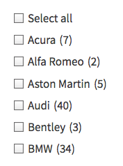
This creates “Select all” link, which will be styled with the same checkbox as the other facet choices, because of the facetwp-checkbox class.
Instead of a checkbox-style choice, you could also create a normal text link, a button, or an icon. In that case, remove the facetwp-checkbox class (because of its attached styling), and adapt the CSS selector used in line 7 of the code below.
Whatever you do, make sure that the “Select all” element is outside of the facet container itself. Don’t try to add it to the actual choices with a hook.
Next, add the following code to your functions.php. The first part attaches a click event to the above-created element. Make sure the selector in line 7 corresponds with its class(es). Then in line 6, replace my_facet_name with the name of your Checkboxes facet.
The second part makes sure the “Select all” checkbox will be selected when the page is loaded with all choices of the facet already selected. You can remove this part if you’re not using a checkbox for the “Select all” choice, or otherwise don’t need the state of it reflected in its (checked) class.
How to use custom PHP code?
PHP code can be added to your (child) theme's functions.php file. Alternatively, you can use the Custom Hooks add-on, or a code snippets plugin. More info
add_action( 'facetwp_scripts', function() { ?> <script> (function($) { const facet_name = 'my_facet name'; // Replace 'my_facet_name' with the name of your Checkboxes facet const select_all_selector = '.facetwp-checkbox.select-all'; // Adapt the CSS selector so it corresponds with your "Select all" HTML element $().on('click', select_all_selector, function() { if ( $(this).hasClass('checked') ) { FWP.reset(facet_name); } else { var available = []; $( '.facetwp-facet-' + facet_name + ' .facetwp-checkbox' ).each( function () { available.push( $(this).attr( 'data-value' ) ); }); // Use the variable for FWP.facets[] FWP.facets[facet_name] = available; FWP.is_reset = true; // don't parse facets FWP.refresh(); } $(this).toggleClass('checked'); }); // Set 'Select all' class to 'checked' if on page load all choices are already selected document.addEventListener('facetwp-loaded', function() { if ( !FWP.loaded ) { // on first page load // Get the total number facet choices in this facet const total_choices = $('.facetwp-facet-checkboxes .facetwp-checkbox').nodes.length; // Get the number of currently selected choices for this facet const currently_selected = FWP.facets[facet_name] ? FWP.facets[facet_name].length : 0; // Check if the total available choices match the currently selected choices, // also ensure that at least one choice is selected (to avoid checking 'select all' when nothing is selected). if (total_choices > 0 && total_choices === currently_selected) { $(select_all_selector).addClass('checked'); } else { $(select_all_selector).removeClass('checked'); } } }); })(fUtil); </script> <?php });