Date Range
Overview
 The Date Range facet type allows users to filter content by start date, end date, or both.
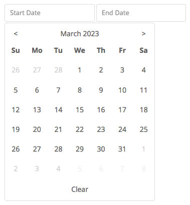
Depending on your settings, the facet will show one or two date fields. When clicking these fields, a date picker is displayed to select a date. The picker will show the whole range of dates in between which posts are available in the listing. This date picker range can be customized if needed.
The facet can be set up to filter posts with the exact entered date, starting before or after the entered date, or between the entered start- and end dates.
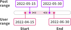
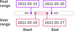
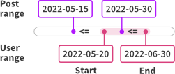
If your posts themselves have a start- and end date, you can set a second data source for the posts’ end date. In this situation, you can use the Compare type setting to determine how the post date range is compared with the date range entered in the facet.
Available options
| Name | Description |
|---|---|
| Data source | Where the value lives (taxonomy, custom field, post attribute). If you also set an “Other data source”, this value will be used for the Start Date. The date values need to be stored in the correct format. |
| Other data source | Use this setting if your posts also have an end date. In this case, choose “Start + End Dates” in the Fields to show setting, and set a compare type to determine how the post date range is compared with the date range entered in the facet. |
| Compare type | This setting is only relevant when the Other data source setting is in use, and Fields to show is set top “Start + End Dates”. It determines how the range of the post’s two data source values is compared to the user-selected range. Note that for all compare types, <= and >= comparisons are used:
|
| Fields to show | The date input fields to show in the facet:
Note: if you use a second data source, it is recommended to set this setting to “Start + End Dates”. If you choose “Start Date” or “End Date”, only that date is compared. If you choose “Exact Date”, the comparison will use that date for both the upper and the lower limit of the user range. |
| Display format | The front-facing date format in the facet’s input field(s). See Date formatting. |
Data source date format
When choosing a custom date field as the facet’s data source, make sure that the date values are stored as YYYY-MM-DD or YYYY-MM-DD HH:MM:SS.
Alternatively, use the facetwp_index_row hook to format the value correctly before indexing.
FacetWP also supports the Advanced Custom Fields “Date Picker” and “Date Time Picker” field types. It will automatically process the way these fields store dates in the wp_postmeta database table (as YYYYMMDD for Date Picker, and as YYYY-MM-DD HH:MM:SS for Date Time Picker). These fields’ “Display Format” and “Return Format” settings have no influence on this.
Date formatting
The following PHP datetime formats can be used in the Display format setting, to format the front-facing date in the input field(s):
d– day (2 digits)j– day (without leading zeros)m– month number (2 digits)n– month number (without leading zeros)F– month (full)M– month (short)y– year (last 2 digits)Y– year (full)
Examples:
Y-m-d– 2021-01-18F j, Y– January 18, 2021j M Y– 18 Jan 2021
Value storage and emtpy post range values
If a Date Range facet uses two data sources, the lower value is stored as facet_value, and the upper value is stored as facet_display_value in the index table.
There are a few things to keep in mind in this situation:
- If a post has no date set for the first (main) data source field, the post will not be indexed, so it will never appear in the results. The same is true for posts that do not yet have this field set in the database because they have not been saved after adding the custom field in (for example) Advanced Custom Fields.
- If a post has no date set for the second data source field, or if that field has not yet been saved for the first time, the post will be indexed but the date for the post’s range upper limit will then be set to
0. This may lead to unexpected or illogical results, depending on the “Compare type” you have set for the facet.
To prevent the above situations, make sure that if you use two data source fields, all posts actually have two dates set.
Emtpy Start Date or End Date fields
What happens if a Date Range facet uses two data sources, and a user does not enter a date into the “Start Date” or “End Date” field? It depends on the “Compare type” you have set:
- If the facet’s “Compare type” is set to “Basic”, only the field which has a date entered is used in the comparison.
- If the facet’s “Compare type” is set to “Enclose” or “Intersect”, an empty “Start Date” field will be compared as
0000-00-00and an empty “End Date” field as3000-12-31. Note that in this case, setting “Enclose” as “Compare type” will lead to 0 results, as the post’s range will never surround these user range dates.
Translate the calendar and dates
With the following code you can translate the calendar and range dates to your site’s language.
Make sure to replace my_date_range_facet with the name of your Date Range facet (the name that is used in the facet’s shortcode), on lines 2 and 3.
How to use custom PHP code?
PHP code can be added to your (child) theme's functions.php file. Alternatively, you can use the Custom Hooks add-on, or a code snippets plugin. More info
add_filter( 'facetwp_render_output', function( $output, $params ) { if ( isset( $output['settings']['my_date_range_facet'] ) ) { $output['settings']['my_date_range_facet']['locale'] = [ 'weekdays_short' => [ 'Dg', 'Dl', 'Dt', 'Dc', 'Dj', 'Dv', 'Ds' ], // abbreviations for Sun to Sat 'months_short' => [ 'Gen', 'Febr', 'Març', 'Abr', 'Maig', 'Juny', 'Jul', 'Ag', 'Set', 'Oct', 'Nov', 'Des' ], // abreviations for months Jan to Dec 'months' => [ 'Gener', 'Febrer', 'Març', 'Abril', 'Maig', 'Juny', 'Juliol', 'Agost', 'Setembre', 'Octubre', 'Novembre', 'Desembre' ], // full names of months Jan to Dec 'firstDayOfWeek' => 1, // 1 is Monday, 0 is Sunday 'clearText' => 'Clear' // text for clear button ]; } return $output; }, 10, 2 );
Change or translate the placeholder texts
Depending on the settings, the Date Range input fields can show the following placeholder texts: “Date”, “Start Date” and “End Date”. Additionally, if there are no date values for these fields, the following placeholder texts will show: “No dates”, “No start dates” and “No end dates”.
These placeholder texts are all translatable strings. To translate them, you can use a translation plugin like Loco Translate, or use the gettext WordPress filter, by adding the following code to your (child) theme’s functions.php:
How to use custom PHP code?
PHP code can be added to your (child) theme's functions.php file. Alternatively, you can use the Custom Hooks add-on, or a code snippets plugin. More info
add_filter( 'gettext', function( $translated_text, $text, $domain ) { if ( 'fwp-front' == $domain ) { // Date(s) placeholder texts if ( 'Date' == $translated_text ) { $translated_text = 'Event date'; } elseif ( 'Start date' == $translated_text ) { $translated_text = 'Start event date'; } elseif ( 'End date' == $translated_text ) { $translated_text = 'End event date'; // No dates placeholder texts } elseif ( 'No dates' == $translated_text ) { $translated_text = 'No event dates'; } elseif ( 'No start dates' == $translated_text ) { $translated_text = 'No start event dates'; } elseif ( 'No end dates' == $translated_text ) { $translated_text = 'No end event dates'; } } return $translated_text; }, 10, 3 );
These placeholder texts can also be customized with the facetwp_i18n hook.
Customize the date picker range
By default, the date picker will only show the date range that includes dates for which there are posts available. This displayed range can be customized by changing the facet’s settings with the facetwp_render_output hook.
The following example forces the date range between 2022-01-01 and today, for the date picker of both the Start Date and End Date field. Which lines are necessary depends on the Fields to show setting.
You can set a maxDate in the future, or, if you want no specific end date (and no future dates shown), you can use date('Y-m-d'), which dynamically returns today’s date:
How to use custom PHP code?
PHP code can be added to your (child) theme's functions.php file. Alternatively, you can use the Custom Hooks add-on, or a code snippets plugin. More info
// Replace "my-daterange-facet" with the name of your Date Range facet add_filter( 'facetwp_render_output', function( $output, $params ) { // Modify the displayed date range in the date picker for the Start Date field: $output['settings']['my-daterange-facet']['range']['min']['minDate'] = '2022-01-01'; $output['settings']['my-daterange-facet']['range']['min']['maxDate'] = date( 'Y-m-d' ); // Today // Modify the displayed date range in the date picker for the End Date field: $output['settings']['my-daterange-facet']['range']['max']['minDate'] = '2022-01-01'; $output['settings']['my-daterange-facet']['range']['max']['maxDate'] = date( 'Y-m-d' ); // Today return $output; }, 10, 2 );
Enable text input for the date range picker
By default, the Date Range facet’s date picker fields are disabled for manual date input, and users need to use the calendar to pick the date(s).
There are scenarios in which manual date input is a more user-friendly or accessible solution. For example, if an archive of content goes back many years and the calendar UI is too clumsy to navigate back all those years.
To enable manual input of dates in Date Range facets, add the following script to your (child) theme’s functions.php.
The code has a built-in validator that checks each date field when a value is entered, according to the desired date format as set in line 12. See below for how validation works exactly).
The manual input works with using Enter/Return after using the first field, as well as tabbing to the second field. When using the tab key in the first field, there is no refresh so the user can directly type in the focused second field, then hit Enter/Return. The second field value can be set by using Enter/Return as well as using the Tab key. The code also improves keyboard navigation when using the date picker, for accessibility.
The code will also work when auto-refresh is disabled and you have a Submit/Apply button. Lines 188-218 are only needed in this situation.
How to use custom PHP code?
PHP code can be added to your (child) theme's functions.php file. Alternatively, you can use the Custom Hooks add-on, or a code snippets plugin. More info
add_action( 'facetwp_scripts', function() { ?> <script> (function($) { // Set the desired date format: // If monthfirst = false (EU/world): (d)d-(m)m-yyyy and yyyy-(m)m-(d)d are accepted, and equivalents with / instead of - // If monthfirst = true (USA): (m)m-(d)d-yyyy and yyyy-(m)m-(d)d are accepted, and equivalents with / instead of - // Important: make sure the 'Display format' setting matches the date format as set below: // use 'd-m-Y' for monthfirst = false, and 'm-d-Y' for monthfirst = true. let monthfirst = false; // Set the error message and duration for invalid dates let errormessage = "Invalid date"; let errorduration = 1000; // in milliseconds $(function() { // Remove readonly attribute FWP.hooks.addAction('facetwp/loaded', function() { var date_inputs = document.querySelectorAll('.facetwp-type-date_range input'); date_inputs.forEach(function(date_input) { date_input.removeAttribute('readonly'); }); }, 100); }); // Set altFormat (overwrites facet's Display Format setting to comply with format set above) // Set focus back to the date range input after date picker is used for keyboard navigation if ('undefined' !== typeof FWP.hooks) { FWP.hooks.addFilter('facetwp/set_options/date_range', function(opts) { // Set default format for consistency in input detection if ( monthfirst ) { opts.altFormat = 'm-d-Y'; } else { opts.altFormat = 'd-m-Y'; } // Set focus on input after date picker used opts.onChange = function(obj) { FWP.autoload(); if ('undefined' !== typeof obj.el) { obj.el._altInput.focus(); } }; return opts; }); } // Validate date input function isValidDate(dateArray) { const [yyyy, mm, dd] = dateArray; if (dateArray.length !== 3) { return false; } if (yyyy <= 0 || yyyy.toString().length !== 4) { return false; } if (mm < 1 || mm > 12) { return false; } const daysInMonth = new Date(yyyy, mm, 0).getDate(); if (dd < 1 || dd > daysInMonth) { return false; } return true; } // Parse date string function parseDateString(dateString) { let date = dateString.replace(/\//g, '-'); date = date.split("-").map((x) => x < 100 ? ('0' + x).slice(-2) : x); let year = date.pop(); if (monthfirst === true) { year.length > 2 ? date.unshift(year) : date.push(year); } else { year.length > 2 ? date.reverse().unshift(year) : date.push(year); } return date; } // Detect Tab press on first date input let tabPressed = false; let inputOrigin = null; $().on('keydown', '.facetwp-type-date_range input', function(e) { if (e.keyCode == 9) { // Tab key tabPressed = true; inputOrigin = this; } else { tabPressed = false; } }); $().on('keyup', '.facetwp-type-date_range input', function(e) { if (e.keyCode === 13) { // Enter/Return key this._input.fdate.close(); let facet_name = this.closest('.facetwp-type-date_range').getAttribute('data-name'); let minmax = this.classList.contains('facetwp-date-min') ? 0 : 1; try { let dateArray = parseDateString(this.value); if (isValidDate(dateArray)) { let dateymd = dateArray.join('-'); FWP.facets[facet_name][minmax] = dateymd; this._input.value = dateymd; if ( ! FWP.auto_refresh === false ) { FWP.setHash(); FWP.fetchData(); } } else { throw errormessage; } } catch (e) { if ( this.value !== '' ) { // Support Clear button this.value = errormessage; } setTimeout(() => { this.value = ""; // Empty second date input without a refresh when invalid date is entered this._input.fdate.open(); }, errorduration ); // An invalid date format displays the error message in the input field, then clears it after 1000 milliseconds. } } else if (tabPressed && e.keyCode === 9) { // Tab key inputOrigin._input.fdate.close(); let facet_name = inputOrigin.closest('.facetwp-type-date_range').getAttribute('data-name'); let minmax = inputOrigin.classList.contains('facetwp-date-min') ? 0 : 1; try { let dateArray = parseDateString(inputOrigin.value); if (isValidDate(dateArray)) { let dateymd = dateArray.join('-'); FWP.facets[facet_name][minmax] = dateymd; inputOrigin._input.value = dateymd; if ( ! FWP.auto_refresh === false ) { FWP.setHash(); // No refresh when tabbing because then input field focus is lost } } else { throw errormessage; } } catch (e) { inputOrigin.value = errormessage; // The error message displayed in the input field when an invalid date is entered. setTimeout(() => { inputOrigin.value = ""; inputOrigin._input.fdate.open(); inputOrigin.focus(); }, errorduration ); // An invalid date format displays the error message in the input field, then clears it after 1000 milliseconds. } } }); // Tabbing in the second input $().on('keydown', '.facetwp-type-date_range input.facetwp-date-max', function(e) { if (tabPressed && e.keyCode == 9) { // Tab key tabPressed = false; this._input.fdate.close(); let facet_name = this.closest('.facetwp-type-date_range').getAttribute('data-name'); let minmax = this.classList.contains('facetwp-date-min') ? 0 : 1; try { let dateArray = parseDateString(this.value); if (isValidDate(dateArray)) { let dateymd = dateArray.join('-'); FWP.facets[facet_name][minmax] = dateymd; this._input.value = dateymd; if ( ! FWP.auto_refresh === false ) { FWP.setHash(); FWP.fetchData(); } } else { throw errormessage; } } catch (e) { this.value = errormessage; // The error message displayed in the input field when an invalid date is entered. setTimeout(() => { this.value = ""; // Empty second date input without a refresh when invalid date is entered this._input.fdate.open(); this.focus(); }, errorduration ); // An invalid date format displays the error message in the input field, then clears it after 1000 milliseconds. } } }); // Include this part only when you have set FWP.auto_refresh to false // Makes the validation work when entering values by keyboard and hitting Apply without using Enter or Tab in the inputs. document.addEventListener('facetwp-refresh', function() { if ( FWP.auto_refresh === false && FWP.is_reset === false ) { $('.facetwp-type-date_range input').each(function() { let facet_name = this.closest('.facetwp-type-date_range').getAttribute('data-name'); let minmax = this.classList.contains('facetwp-date-min') ? 0 : 1; if (this.value) { try { let dateArray = parseDateString(this.value); if (isValidDate(dateArray)) { let dateymd = dateArray.join('-'); FWP.facets[facet_name][minmax] = dateymd; this._input.value = dateymd; } else { throw errormessage; } } catch (e) { this.value = errormessage; // The error message displayed in the input field when an invalid date is entered. FWP.facets[facet_name][minmax] = ''; setTimeout(() => { this.value = ""; }, errorduration ); // An invalid date format displays the error message in the input field, then clears it after 1000 milliseconds. } } }) } }); })(fUtil); </script> <?php }, 100 );
Set the accepted date format
The above script needs to know if valid dates for your users are formatted with the month first (as used mainly in the USA), or with the day first (as used in the EU and most other parts of the world).
This choice can be set in line 12 of the script. Use monthfirst = false; for dd-mm-yyyy format, or monthfirst = true; for mm-dd-yyyy format.
The script has a built-in validator for the entered dates. It accepts the following date inputs as valid in the two formatting situations. Single-digit days and months are supported, as well as - and / separators. Two-digit year inputs (e.g. 06-04-24) are not supported.
Valid dates formonthfirst = false; |
Valid dates formonthfirst = true; |
(d)d-(m)m-yyyy (d)d/(m)m/yyyy |
(m)m-(d)d-yyyy (m)m/(d)d/yyyy |
|---|---|
| For example: 18-07-2024 18-7-2024 18/07/2024 18/7/2024 |
For example: 07-18-2024 7-18-2024 07/18/2024 7/18/2024 |
| yyyy-(m)m-(d)d yyyy/(m)m/(d)d |
yyyy-(m)m-(d)d yyyy/(m)m/(d)d |
| For example: 2024-07-18 2024-7-18 2024/07/18 2024/7/18 |
For example: 2024-07-18 2024-7-18 2024/07/18 2024/7/18 |
Besides checking for the correct format as shown in the above table, the script also checks if a day value actually exists for the month entered. So 31-04-2024 and 04-31-2024 are invalid, as April only has 30 days.

When a user enters an invalid date, the field will briefly show the error message “Invalid date” and then clear. The default duration of the error message display is 1500 milliseconds.
The error message text itself can be changed in line 15. The duration of the message can be changed in line line 16.
Change the placeholder texts to show the expected date format

monthfirst = false).To guide the user to input the date in the correct format, it is a good idea to change the placeholder texts to show the expected format.
The following snippet shows how to do this in both formatting situations:
How to use custom PHP code?
PHP code can be added to your (child) theme's functions.php file. Alternatively, you can use the Custom Hooks add-on, or a code snippets plugin. More info
add_filter( 'gettext', function( $translated_text, $text, $domain ) { if ( 'fwp-front' == $domain ) { // Use with monthfirst = false if ( 'Date' == $translated_text ) { $translated_text = 'Date (dd-mm-yyyy)'; } elseif ( 'Start date' == $translated_text ) { $translated_text = 'Start date (dd-mm-yyyy)'; } elseif ( 'End date' == $translated_text ) { $translated_text = 'End date (dd-mm-yyyy)'; } // Use with monthfirst = true // if ( 'Date' == $translated_text ) { // $translated_text = 'Date (mm-dd-yyyy)'; // } elseif ( 'Start date' == $translated_text ) { // $translated_text = 'Start date (mm-dd-yyyy)'; // } elseif ( 'End date' == $translated_text ) { // $translated_text = 'End date (mm-dd-yyyy)'; // } } return $translated_text; }, 10, 3 );


