What’s new in FacetWP 2.2
For FacetWP 2.2, we decided to focus our efforts on improving the admin UI. We feel like this version makes the plugin vastly more user-friendly.
Less visual clutter
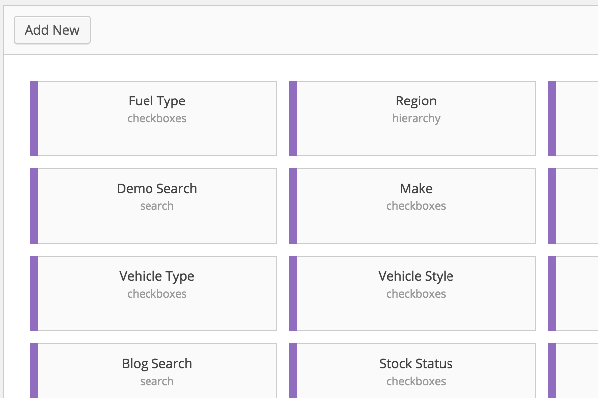
In previous versions, the Facets and Templates tabs often became visually overwhelming. The list of all facets appeared on the left, and the active facet’s settings were displayed on the right.
In FacetWP 2.2, we display only the necessary information on the listing screens. Hovering over a “card” displays the delete icon, and clicking on the card opens up the detail view.

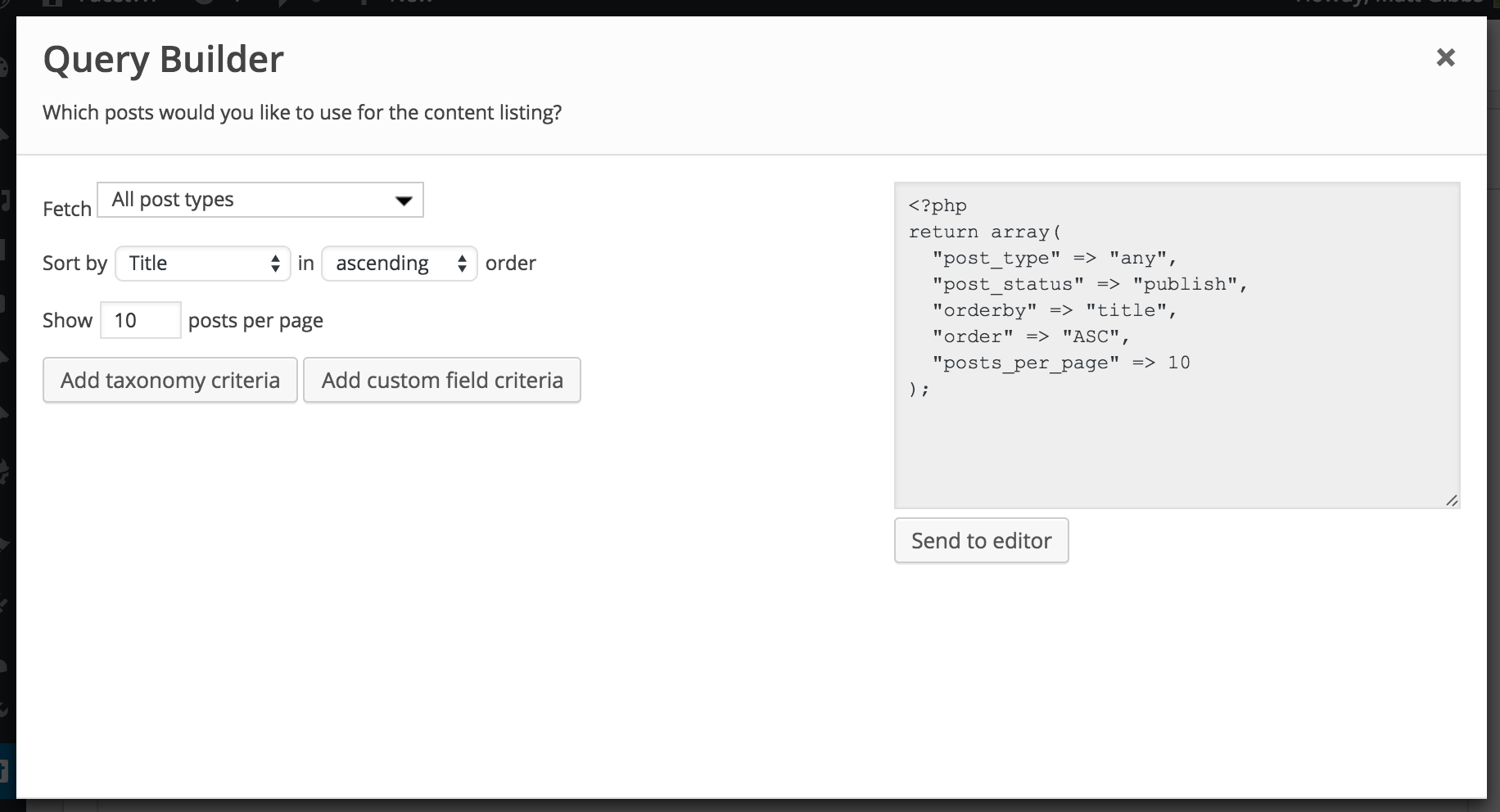
Query builder
When creating templates from the admin UI, a basic understanding of WP_Query was required – and was overwhelming for non-developers. In FacetWP 2.2, we’ve built an entirely custom Query Builder tool for making it easy to fetch the desired posts.

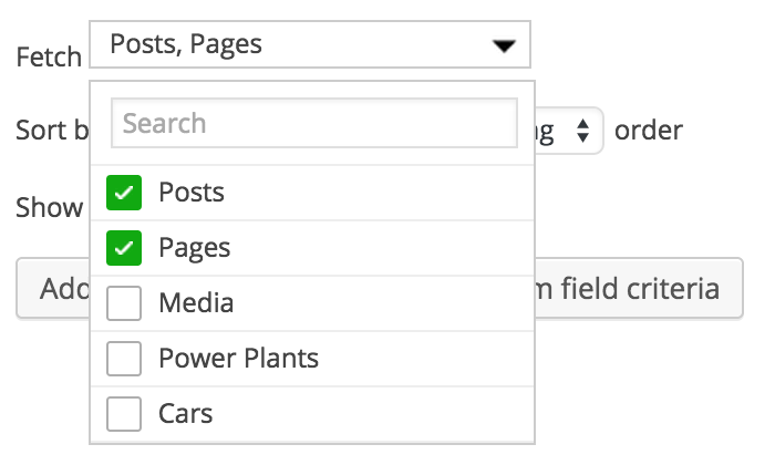
New dropdown replacement tool
Normally it’s not a great idea to re-invent the wheel. There’s other javascript libraries out there for replacing HTML dropdown boxes. However, we wanted one that supported multi-select with a dropdown UI, included a search box, and didn’t require any dependencies aside from jQuery itself.

We enjoyed building FacetWP 2.2, and we hope you enjoy using it!
